Code: 46816643
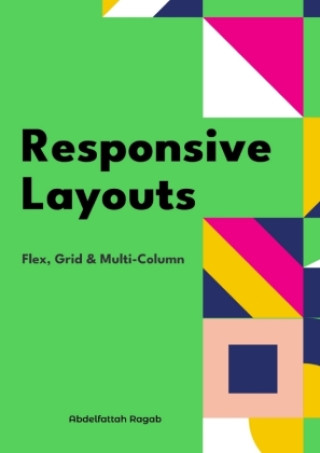
Responsive Layouts
by Abdelfattah Ragab
Welcome to the book "Responsive Layouts: Flex, Grid and Multi-Column"In this book I explain the three best-known responsive layouts: the Flexbox, the Grid and the Multi-Column layout.Flexbox is a one-dimensional layout that only w ... more


- Language:
 English
 - Binding: Hardback
- Number of pages: 200
Publisher: tredition, 2024
- More about this


You might also like
-

Moonwalk
14.03 € -18 % -

The Score
13.73 € -12 % -

The Deal
12.31 € -9 % -

Berserk Deluxe Volume 1
35.85 € -25 % -

The Mistake
13.53 € -

Jujutsu Kaisen, Vol. 30
7.67 € -30 % -

Berserk Deluxe Volume 2
33.22 € -30 % -

Dancing The Dream
19.89 € -31 % -

Murdoku
14.03 € -25 % -

Berserk Deluxe Volume 3
55.14 € -

The Goal
14.64 € -

White Nights
4.54 € -

Chainsaw Man, Vol. 21
9.89 € -20 % -

Invincible Compendium Volume 2
45.75 € -24 % -

The Legacy
11.91 € -22 % -

Lord of Mysteries, Vol. 3: The Clown, Part III
17.06 € -13 % -

Jujutsu Kaisen, Vol. 29
9.89 € -20 % -

Invincible Compendium Volume 3
46.35 € -23 % -

Witch Hat Atelier: Grimoire Edition 1
34.94 € -29 % -

JoJo's Bizarre Adventure: Part 7--Steel Ball Run, Vol. 7
18.17 € -25 % -

Jujutsu Kaisen, Vol. 26
9.89 € -20 %
Give this book as a present today
- Order book and choose Gift Order.
- We will send you book gift voucher at once. You can give it out to anyone.
- Book will be send to donee, nothing more to care about.
More about Responsive Layouts
You get 71 loyalty points
 Book synopsis
Welcome to the book "Responsive Layouts: Flex, Grid and Multi-Column"In this book I explain the three best-known responsive layouts: the Flexbox, the Grid and the Multi-Column layout.Flexbox is a one-dimensional layout that only works in one dimension at a time, either horizontally or vertically.The grid layout is a two-dimensional layout that distributes the elements horizontally and vertically at the same time.The multi-column layout is a special layout for magazines and newspapers, where the text should flow in columns with spacing, rules, etc.I'll explain all the properties and their values and how they affect the distribution of elements on the screen.So let's get started.
Book details
Book category Books in English Computing & information technology Computer programming / software development Web programming
29.49 €
- Full title: Responsive Layouts
- Subtitle: Flex, Grid & Multi-Column. DE
- Author: Abdelfattah Ragab
- Language: English
- Binding: Hardback
- Number of pages: 200
- EAN: 9783384410535
- ID: 46816643
- Publisher: tredition
- Weight: 429 g
- Dimensions: 210 × 148 mm
- Published: 2024
Collection points Bratislava a 12824 dalších
Copyright ©2008-26 najlacnejsie-knihy.sk All rights reservedPrivacyCookies

 25652 collection points
 Delivery 2.99 €
 02/210 210 99 (8-15.30h)